Aire Health
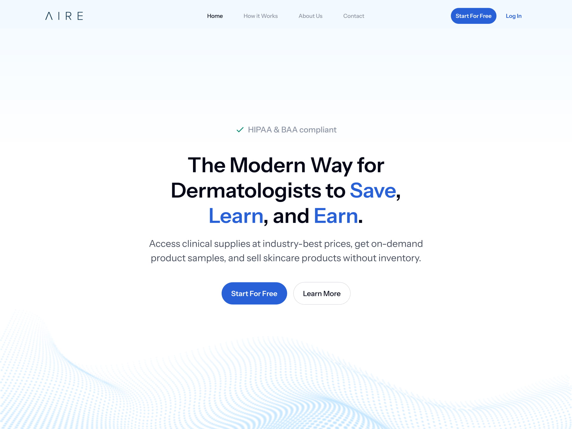
The Modern Way for Dermatologists to Save, Learn and Earn
Overview
AIRE’s website serves a diverse audience of dermatologists, residents, and skincare brands, but the original design struggled to clearly communicate the platform’s value and guide users toward meaningful actions. The goal of this redesign was to create a homepage that delivers a clear, consistent message, simplifies navigation, and provides tailored experiences for each user type.
By addressing inconsistent messaging, unclear pathways, and weak trust signals, the project aimed to improve engagement, build credibility, and drive conversions, transforming AIRE’s website into an intuitive, high-performing entry point for the platform.
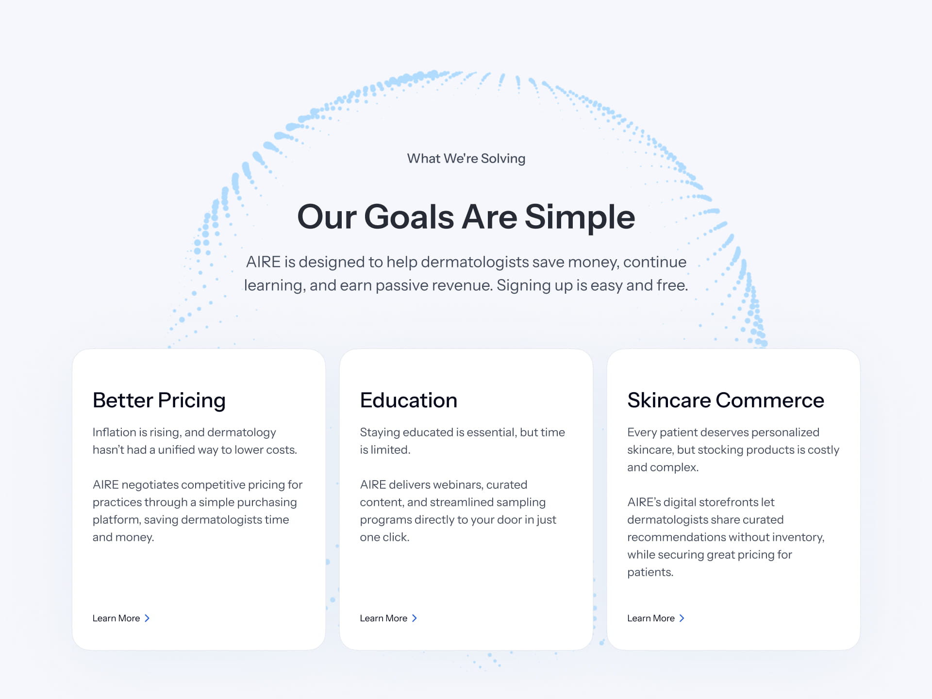
Unclear Value Proposition & Messaging
The homepage lacks a clear, consistent narrative about what AIRE offers and its benefits. Vague positioning and shifting messaging make it difficult for users to quickly understand the platform’s value.
Poor User Targeting & Journey Clarity
Content does not effectively differentiate between key audiences, and users are not guided through tailored pathways. This results in confusion about relevance and what actions to take next.
Weak Information Architecture & Navigation
The structure of products, content, and navigation is unclear and unintuitive. Users struggle to understand product relationships and find relevant information efficiently.
Low Conversion Optimization & Trust Signals
Ineffective CTAs, lack of progressive engagement paths, and weak social proof reduce user confidence and conversion. Users face friction when deciding to act and lack reassurance to proceed.
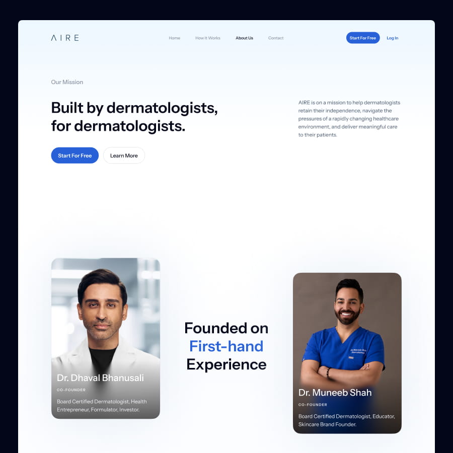
Repositioning AIRE Health as a Cutting-Edge Service
We revitalized the website with a completely new look, leveraging modern design principles to reposition the service as an innovative, cutting-edge platform.
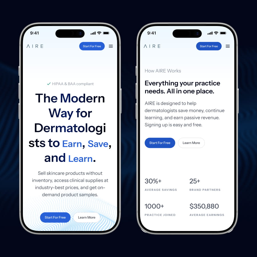
By optimizing the CTA hierarchy, we created a clear, streamlined user journey that drives more direct user activation. Additionally, we designed a concise hero section with a strategic messaging structure that immediately answers the 'who, what, and how.'
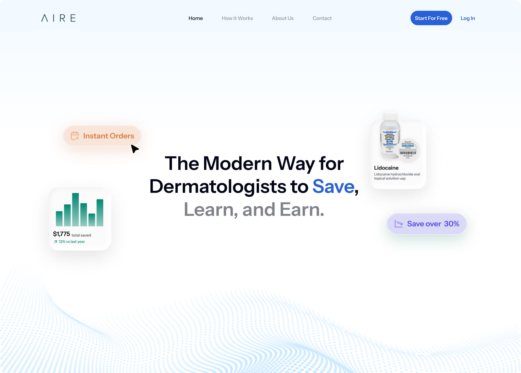
To capture attention right from the start, we highlighted the platform's core benefits using an engaging, scroll-triggered animation.
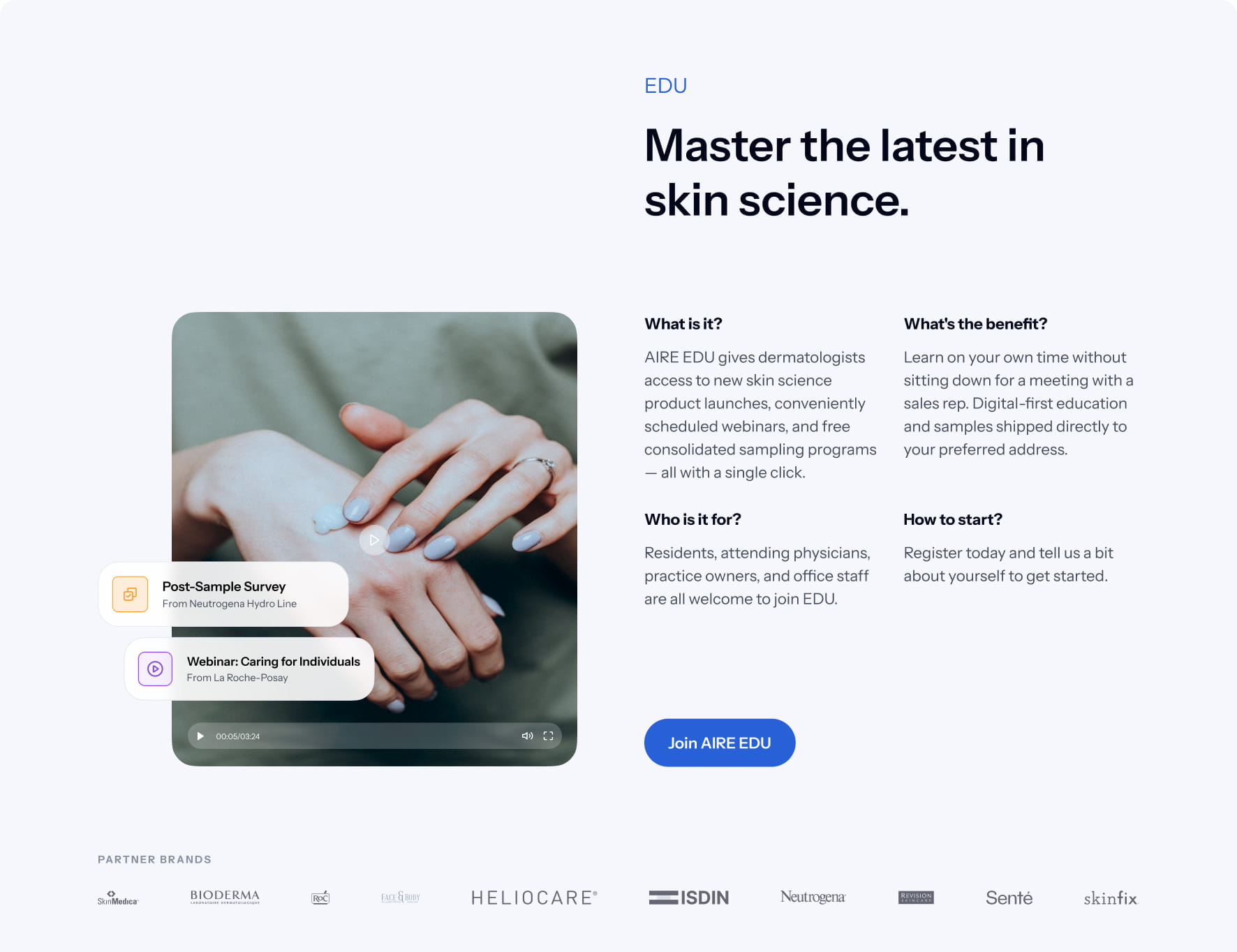

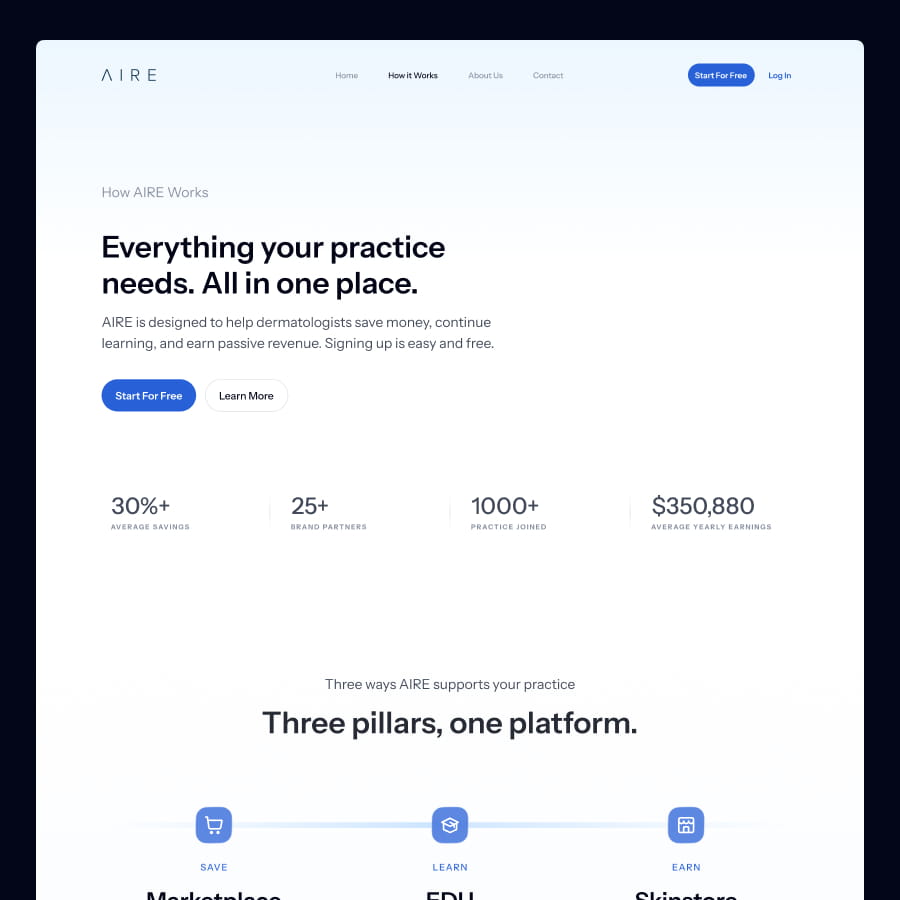
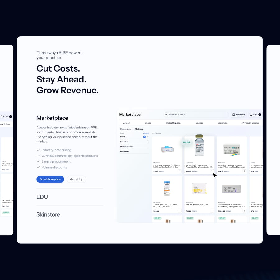
Guiding Users Through a Connected Ecosystem
To reduce cognitive load, we utilized progressive disclosure and a strong visual hierarchy.
We clarified the broader ecosystem, highlighting the relationship and user benefits across the Skinstore, Marketplace, and EDU platforms.
Finally, we drove better engagement through improved user segmentation, creating dedicated sections with tailored value propositions and strategic CTAs.
Integrating AI into the Design Process
To accelerate the design process, we integrated AI tools like Figma Make into our workflow. This allowed us to rapidly generate UI variations, explore layouts, and draft content, as well as proactively identify inconsistencies, usability risks, and accessibility hurdles. Ultimately, AI acted as a powerful engine for divergence and efficiency, while all final decisions, precise refinements, and the overall craft remained strictly design-led.
AI supported divergence and efficiency, while final decisions, refinement, and craft remained design-led.
Conclusion
Through a comprehensive UX audit and redesign, AIRE’s website has been transformed into a clear, user-focused platform that communicates value, guides diverse audiences, and builds trust. By streamlining messaging, establishing intuitive navigation, and highlighting tailored pathways for dermatologists, residents, and brands, the site now reduces friction and encourages engagement at every stage.
Strategically designed CTAs, progressive engagement options, and persuasive social proof ensure users feel confident and informed, while visual hierarchy and color use create a cohesive, professional experience. The redesign not only enhances usability and discoverability but also positions AIRE as a credible, industry-leading platform, driving increased conversions, user acquisition, and long-term engagement.
This project demonstrates how aligning user needs with clear design and content strategy can transform a complex platform into an accessible, high-performing digital experience.


Start a project


