DataLab USA
From Outdated to Insightful: DataLab USA Redesign
Overview
This case study presents the redesign of DataLab USA’s website, focused on transforming an outdated and unclear digital presence into a modern, structured experience. The original site struggled with repetitive content, weak messaging, and a visual identity that no longer reflected the company’s expertise in the data and analytics space.
The new design introduces clearer communication, improved hierarchy, and a more intentional visual system to better express the company’s capabilities. The result is a concise, credible, and modern experience that reflects DataLab USA’s long-standing expertise and value in helping businesses grow through data-driven solutions.
Outdated Visual Identity
The previous website no longer reflected the company’s expertise or position within the data and analytics industry. Its dated interface, inconsistent styling, and lack of modern design patterns reduced credibility and made the brand feel behind current industry standards. As a result, the platform failed to create a strong first impression for potential clients and partners.
Repetitive and Unstructured Content
Content across the website was duplicated in multiple sections and pages, creating an overwhelming and repetitive browsing experience. Important information was buried under redundant messaging, making it difficult for users to quickly understand key services and capabilities. The lack of a clear content hierarchy also weakened navigation and overall usability.
Unclear Value Proposition
The existing website struggled to clearly explain what DataLab USA does and how its services provide value to clients. Technical capabilities, data infrastructure, and analytics solutions were presented in a vague and inaccessible way that did not align with the language commonly used in the industry. This created a disconnect between the company’s expertise and how it was perceived online.

Crafting a Modern, Trustworthy, and Industry-Aware Brand Voice
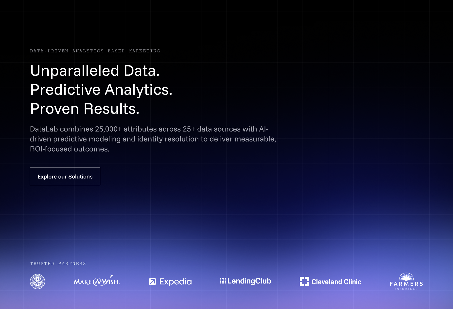
A large part of the redesign focused on redefining the website’s tone of voice and overall messaging strategy. The goal was to position DataLab USA as a modern, cutting-edge SaaS company while maintaining the credibility and discretion expected from a business operating in the data and analytics industry. We introduced a more direct and concise communication style that simplified complex services without losing technical depth, making the platform feel both accessible and highly professional.
Special attention was given to balancing innovation with trust. The copy emphasizes DataLab USA’s decades of experience, proprietary technology, and proven results-driven approach, while carefully reinforcing themes of privacy, reliability, and data responsibility. Every section was written to communicate value quickly and clearly, helping potential clients immediately understand how the company’s services support business growth and customer acquisition.
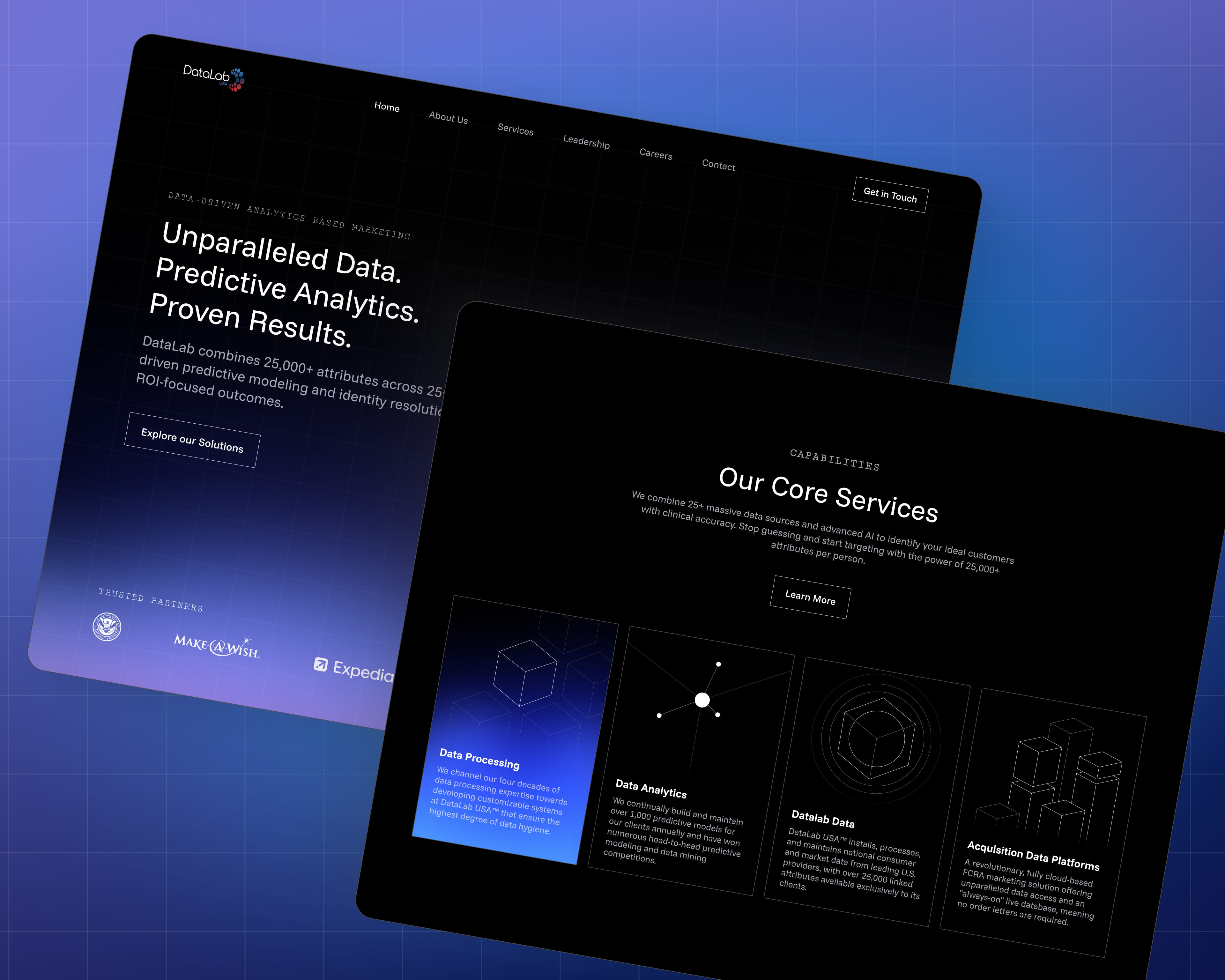
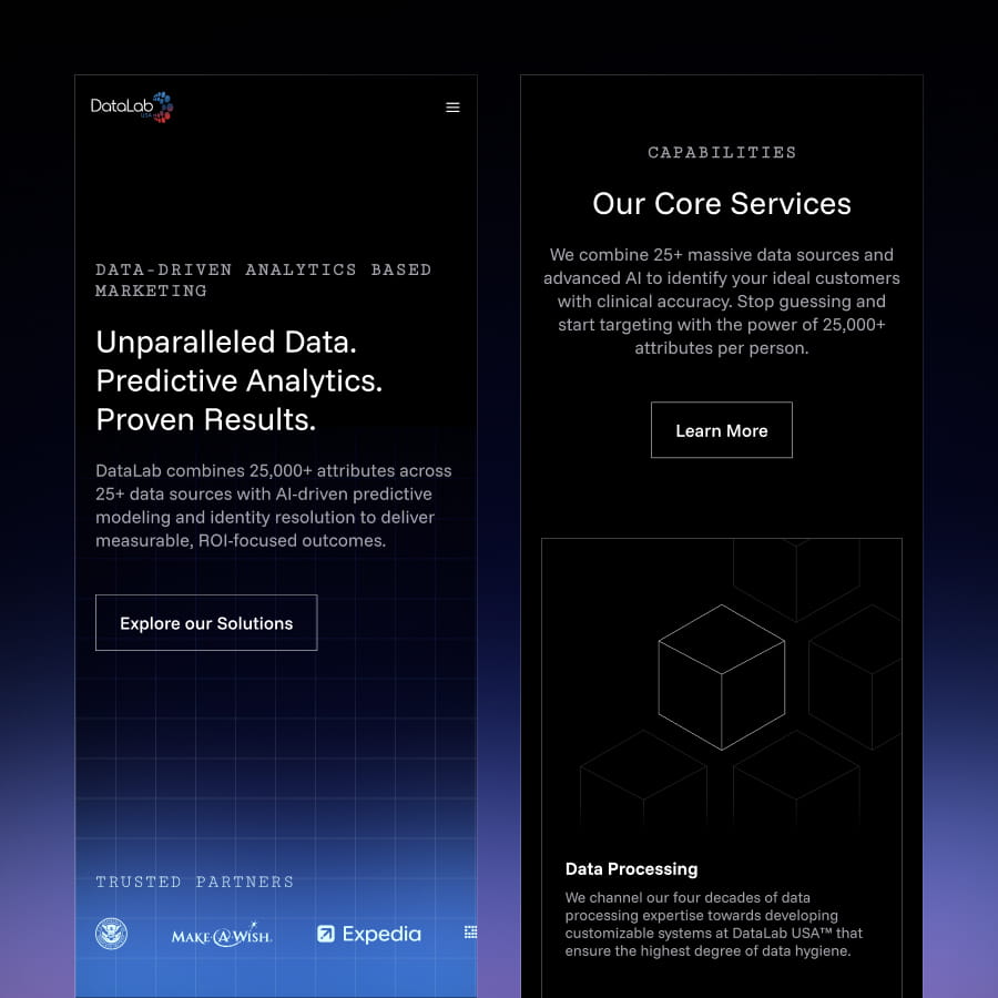
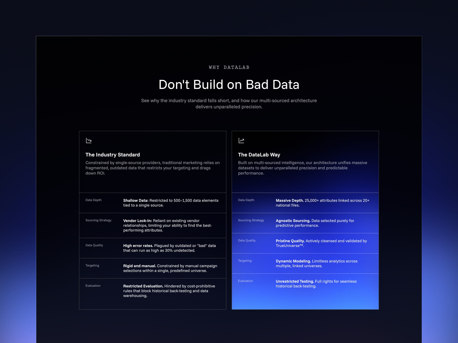
Crafting a Design Language to Communicate Precision
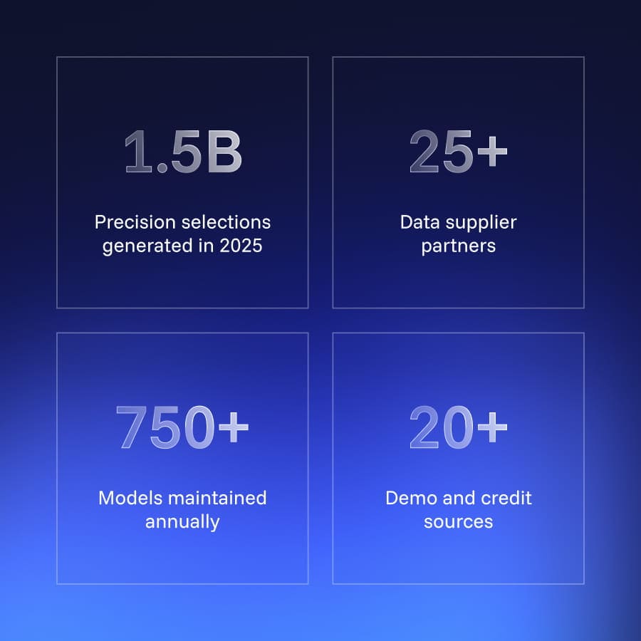
The visual direction of the website was built around a minimal black-and-white aesthetic designed to communicate precision, clarity, and technical sophistication. To introduce contrast and guide attention throughout the interface, we used a subtle blue gradient system for hover states, highlighted content, and interactive elements. This restrained use of color helped create visual hierarchy while reinforcing the company’s modern and technology-driven identity.
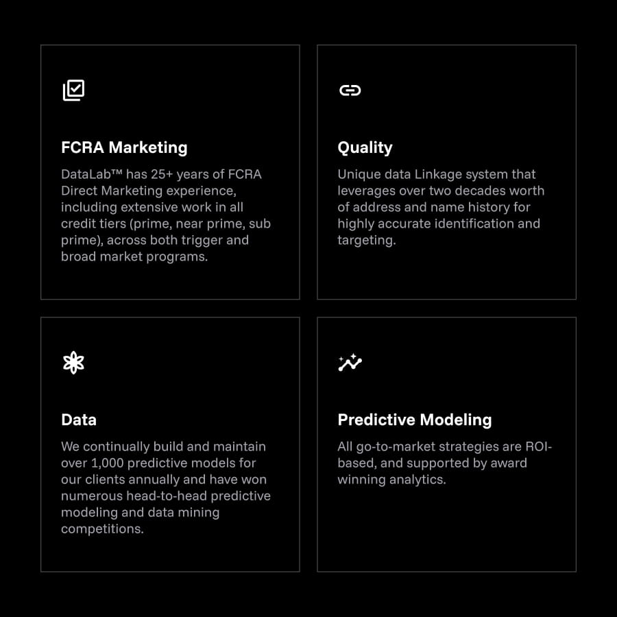
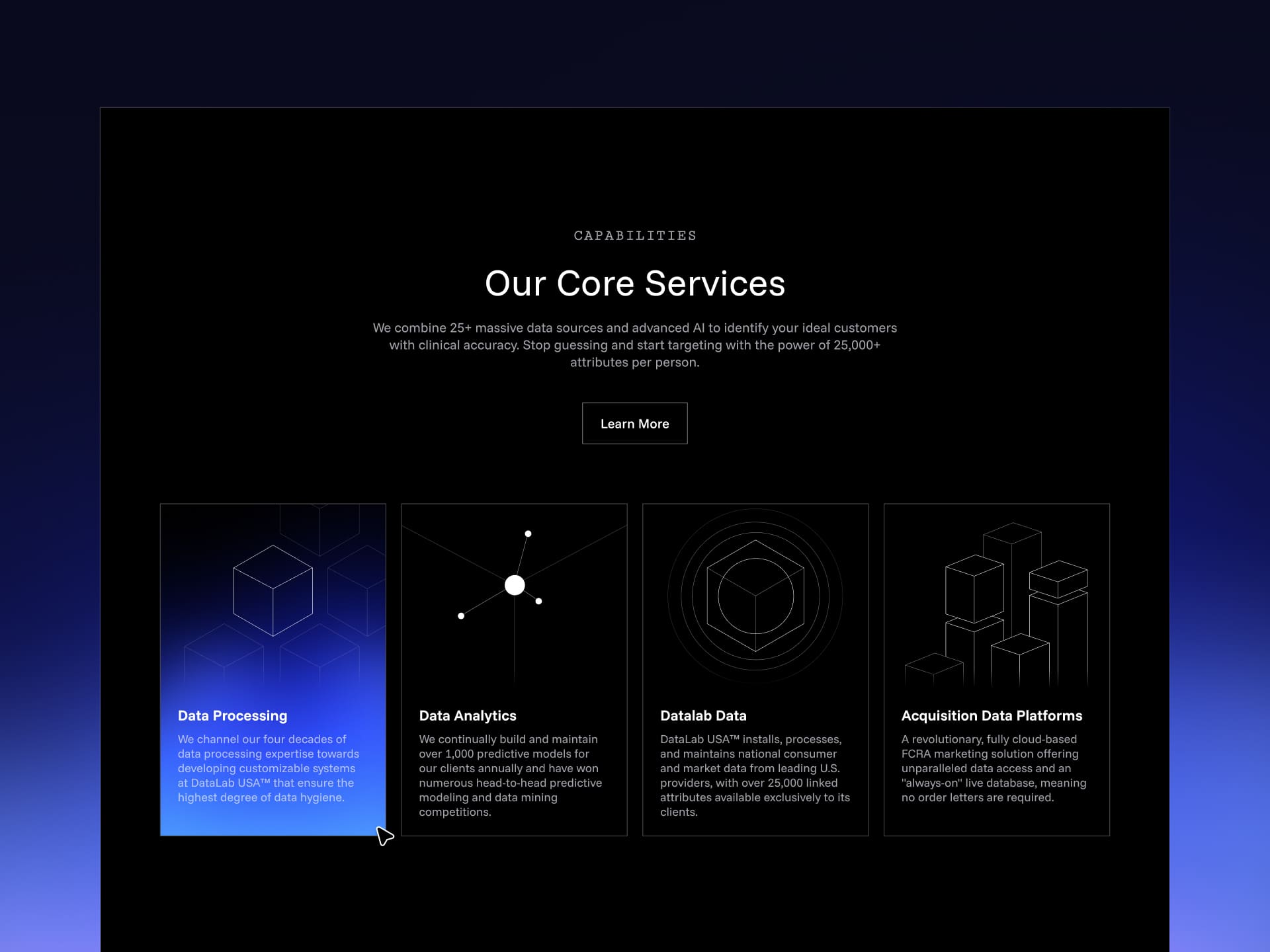
The interface language was intentionally sharp and structured. Angular shapes, thin dividers, and square-based layouts were used throughout the design system to create a stark and highly controlled visual experience that reflects the analytical nature of the brand. To maintain rhythm across the long-form pages, sections alternate between white, blue, and black backgrounds, helping break down information into clear and digestible blocks. We also designed a set of custom visuals for the service cards, giving each offering a more distinctive presence while supporting the overall visual consistency of the platform.
Conclusion
The redesign of DataLab USA focused on transforming an outdated and unclear digital presence into a modern platform that accurately reflects the company’s expertise and position within the data and analytics industry. Through a combination of strategic content restructuring, refined copywriting, and a bold visual system, the new website communicates complex services in a way that feels both accessible and credible. The result is a cleaner, more focused experience that reinforces trust, highlights the company’s long-standing experience, and presents DataLab USA as a forward-thinking leader in data-driven marketing and analytics solutions.


Start a project


