
PlayerEdge
PlayerEdge — Building Trust Into a Youth Sports Coaching Marketplace
Overview
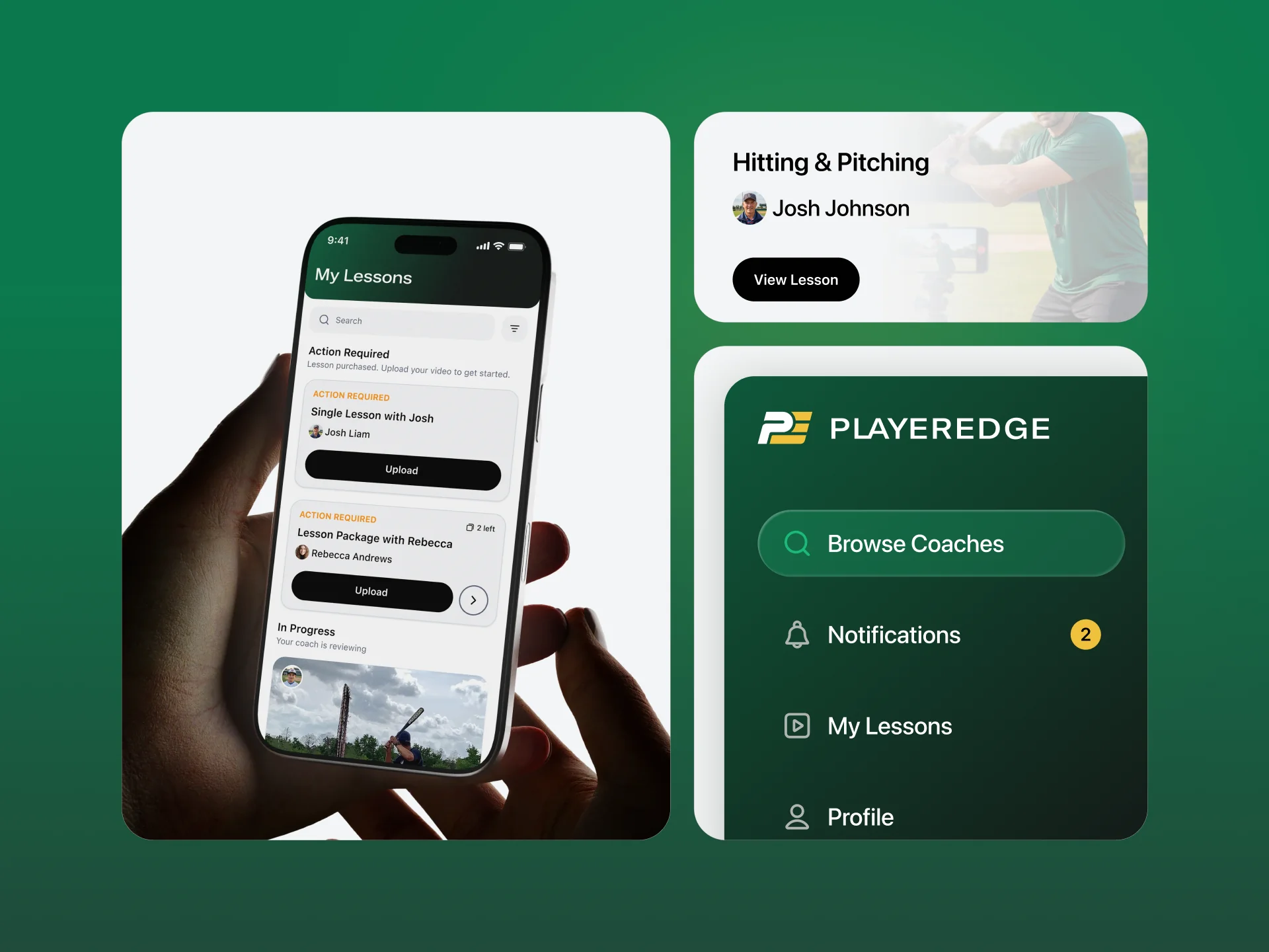
PlayerEdge is a two-sided marketplace for youth sports coaching. Parents upload videos of their kids' gameplay, and professional coaches provide personalized video feedback within 48 hours — think Cameo meets private coaching. The platform launched with baseball and softball, with plans to expand across additional sports.
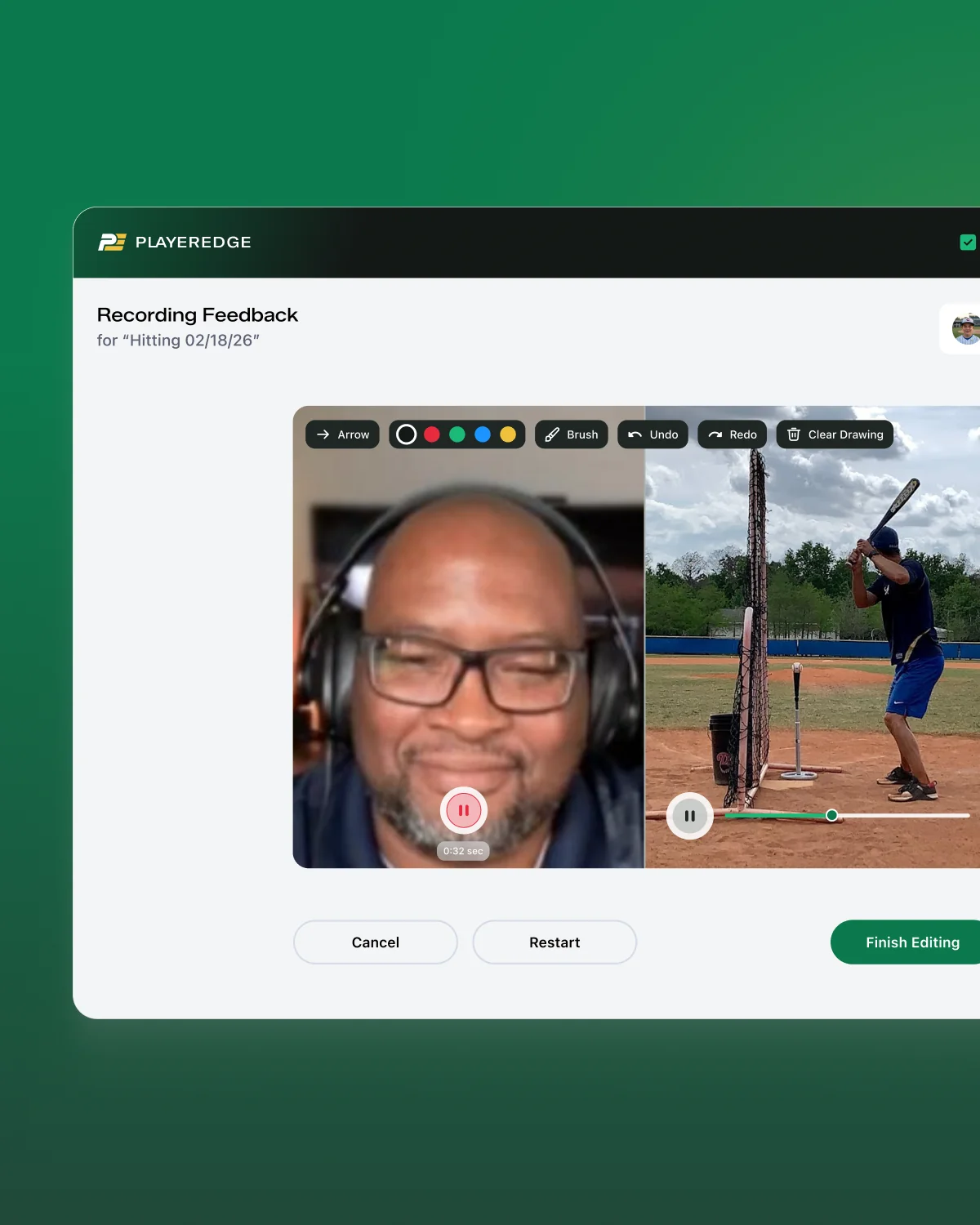
The core loop is simple on the surface: a parent submits a gameplay clip, selects a coach and focus area, pays per lesson ($50–100), and receives a detailed video breakdown with voiceover, annotations, and replay analysis. But underneath that simplicity sits a genuinely complex design problem — one that touches trust, safety, video UX, and marketplace mechanics all at once.


Building trust
Building trust with parents who are sending videos of their children to strangers.
Premium rather than playful
Keeping a youth sports product feeling premium rather than playful or gimmicky.
Effortless on both sides
Making a complex, video-heavy workflow feel effortless on both sides of the platform.

Brand Direction
The client initially leaned toward a red, white, and blue baseball aesthetic — the obvious, expected choice for a sports product. After presenting three brand concepts, that direction was rejected in favor of something more refined and distinctive.
The final palette landed on dark green and gold, inspired by Baylor's color identity:
- Green represents the field and community
- Gold represents value and expertise
The wordmark uses all-caps typography, and the overall tone deliberately targets premium and professional rather than playful or overly sporty — a positioning choice meant to build the parental trust the product depends on. Reference brands included Bruce Bolt and Absolutely Ridiculous, both chosen for how they balance modern appeal with athletic credibility.


UI Design System
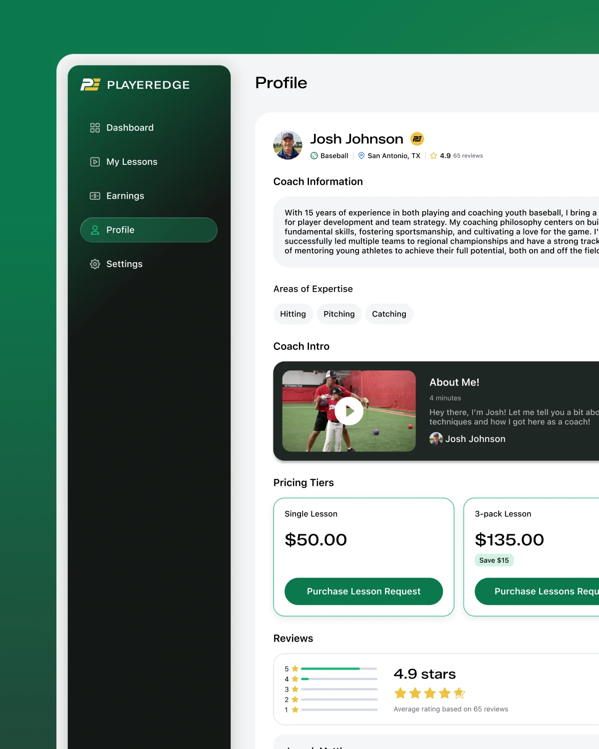
The app was built around a premium, dark-mode-first aesthetic: glass-effect surfaces, rounded corners, and depth created through layered opacity. The color system went through multiple rounds of refinement with the client before landing on its final rules:
- Dark backgrounds at 60–80% black opacity for headers and cards
- Vibrant green reserved specifically for CTAs and payment-related actions
- Gold as the primary accent for navigation and premium touchpoints
- Video thumbnails treated with a 60–70% dark overlay and blur as a background pattern
A key technical constraint shaped the whole system: the platform was built on Bubble, which doesn't support native glass effects. Rather than compromise on the design direction, the approach was reworked using stroke treatments and layered background colors to approximate the intended depth — proof that a strong design language can survive real platform limitations if you're willing to solve around them instead of simplifying them away.
Typography-wise, SF Pro was selected as the primary typeface after GT America was flagged at $1,000+ in licensing costs — a practical trade-off that didn't compromise the premium feel.
Player Experience
The player side (used by athletes 13+ or by parents on behalf of younger kids) was designed around clarity and minimal friction. Users browse coaches by sport, filter by specialty, and submit lesson requests with a video upload.
Key UX decisions:
- Age threshold: athletes 13+ can create their own accounts; anyone younger requires a parent-controlled profile — a direct design response to the trust problem at the heart of the product
- Family member dropdown instead of radio buttons, letting a parent quickly select which child a lesson is for
- Auto-generated lesson titles, using the format “[Focus Area] [Date],” removing unnecessary form friction
- Video uploads capped at 10 minutes, even though typical submissions run 30 seconds to a minute, enough headroom without inviting bloated uploads
The Lesson Flow
The lesson lifecycle was the single most critical UX problem on the platform — it's the mechanism that makes the whole marketplace function. Four statuses drive the entire experience:
- 1. Pending Upload — coach has received the request, player is waiting to submit their video
- 2. In Progress — coach is reviewing footage and recording their response
- 3. Completed — video feedback has been delivered
- 4. Expired — the coach didn't respond in time, triggering an automatic refund
One deliberate decision shaped the payment logic: payment releases automatically the moment a coach uploads their response video — there's no player approval step in between. This reduces friction on the payment side, while the Expired status acts as the platform's built-in safety net, quietly tracking coach reliability over time without adding a manual review step to every transaction.
Visually, the status system is reinforced through card treatment: pending-upload cards use a light, empty state with no video thumbnail. Once a video is attached, the card background switches to a screenshot pulled from the video itself, with a dark overlay and blur — a small detail that makes the “My Lessons” list feel alive and specific to each family's content, rather than generic.

Scope & Delivery
The project was originally scoped at 30–40 hours, covering branding, app design, and website. Final hours logged came in at roughly 85 hours — more than double the original estimate.
That scope expansion came from three places:
- The genuine depth of the UX flows (the lesson lifecycle, the video recording interface, and the mechanics of a dual-sided marketplace all needed real thinking, not just screens)
- Platform constraints introduced by building on Bubble
- Iterative brand refinement across multiple client syncs, as the direction moved from a conventional sports look to something more premium and distinctive
- Design spanned 10 working sessions from January 19 through February 26, 2026, covering brand exploration, UI system development, and detailed UX specification for the development handoff.
Reflection
PlayerEdge is ultimately a trust product wearing a marketplace's clothes. Every real design decision on this project — the age-gated onboarding, the automatic-refund safety net, the shift away from a red-white-and-blue sports cliché toward something closer to a premium athletic brand — traces back to the same question: how do you make a parent comfortable handing over video of their kid to a stranger, and make it feel worth paying for?
The Bubble constraint was a useful forcing function, too. Instead of quietly downgrading the “glass effect, premium, dark-mode” brief because the platform didn't natively support it, the system was rebuilt around strokes and layered opacity to hit the same feeling through different means — a good reminder that design systems should bend around technical constraints rather than get replaced by them.


Start a project


