Rentcheck
4.8 stars
$3.6m
2x

Designing a inspections platform that scaled to $3.6m in funding & helped it's users eliminate 80% of in-person inspections.

How RentCheck Revolutionized Property Inspections
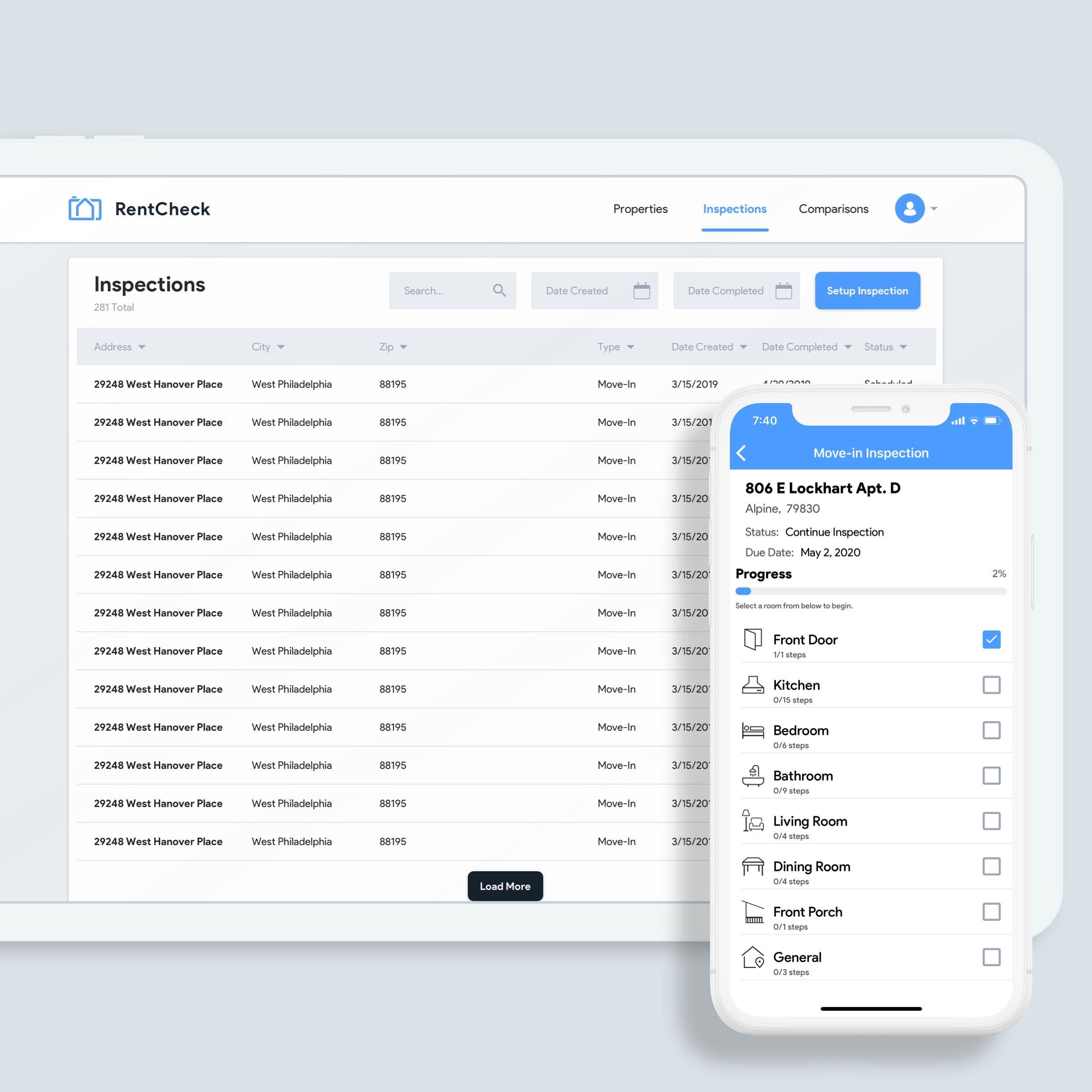
Mid‑2019, RentCheck approached Kaleo to refine their existing MVP, with a focus on improving UX across the mobile app, mobile web, and web portal. Our goal was to redefine the inspection flow for tenants and enable smoother property management for landlords.
4.8 stars
$3.6m
2x


Inspections Take too Long
User research revealed that the primary pain point was the length and complexity of the inspection process—“it takes too long to complete an inspection.” The legacy app had too many steps and lacked clear progress indicators. Our objective was to shorten the flow and guide users more intuitively.
Build out a back office and admin tool for the web
In order to redesign and refine the process as well as build out the brand new web portal, we had a number of preliminary meetings to determine what pain points the users were facing, what was preventing users from completing inspections & what needed improved overall.

Step #1: Streamlined Inspection Flow
Expediting the Process
One of the key challenges in the original inspection flow was the number of discrete, repetitive steps required to document each room or area. Users had to tap through multiple screens just to add a single photo and comment, which slowed down the process and increased drop-off rates. We addressed this by consolidating the camera interface with the input fields for rating, comments, and notes. Now, users can capture media and input feedback in one seamless interaction—eliminating friction and making the experience feel more like a guided walkthrough than a checklist.
This change alone cut the overall number of screens by about 50%, significantly reducing cognitive load and boosting inspection efficiency. We also made sure this redesign preserved clarity by introducing subtle UI cues and context-aware prompts, so users always knew what was expected at each step. The flow became faster not just in number of taps, but in how naturally users could move through it—resulting in fewer abandoned inspections and a higher percentage of complete, actionable reports for property managers.


Step #2: Progress Visibility
One of the most common pieces of feedback from early users was the lack of clarity on how far along they were in an inspection. This created frustration and uncertainty, especially during longer inspections with many rooms. To solve this, we introduced two key layers of progress feedback: inline progress indicators within each section (e.g., “2 of 5 photos added for Kitchen”) and a global progress overview accessible from the top nav. This ensured users always had a sense of how much they’d done and how much was left, reducing anxiety and boosting confidence.
Beyond just percentages, we used iconography and color states to signal inspection completeness at a glance—green for done, yellow for in-progress, and grey for untouched. This system encouraged users to complete every section without feeling overwhelmed. For property managers reviewing reports, this structure also translated into better inspection data, with fewer missed items and more thorough documentation across the board. It also made the app feel more modern and intelligent—like a co-pilot helping them through an otherwise tedious task.
Step #3 – Smooth Property & Inspection Type Setup
For property managers and admin users, the first step in using RentCheck is setting up properties and defining inspection types—a step that was previously buried under too many fields and poorly organized menus. We overhauled this flow by restructuring the setup experience into manageable steps, using progressive disclosure and dynamic form logic to simplify the UI. Users now only see what’s relevant to their selection, whether they’re adding a single-family home or a multi-unit apartment complex.
Additionally, we introduced template-based inspection types with customizable checklists, allowing managers to set up common inspection formats (e.g., move-in, move-out, annual) that could be reused across multiple properties. Smart defaults, contextual tips, and validation made setup both faster and less error-prone. This update had a twofold impact: it sped up onboarding for new users and made it easier for larger property teams to scale usage across portfolios—laying the groundwork for better data consistency and operational efficiency.


Conclusion
For the app redesign we were able to cut down on user time of completion for the inspection flow, we also created a master navigation for user's while they were in an inspection, so that they could navigate the property any way they wanted too instead of having to follow the route the inspection was setup in (front door, kitchen, bathroom, bedroom).

Start a project


