
Stitched Health (Phase 2)
Stitched Health: Rethinking Clinical Learning
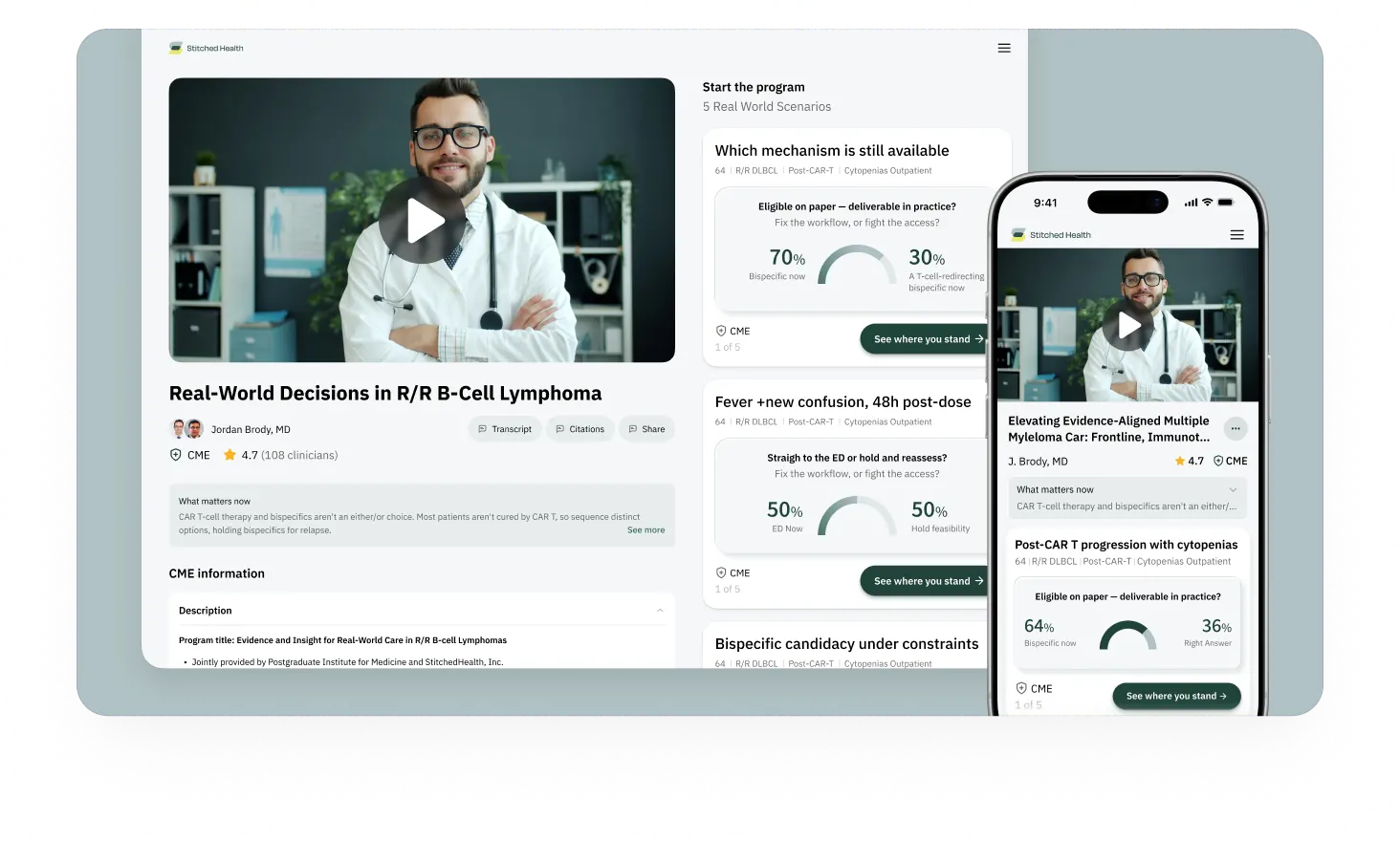
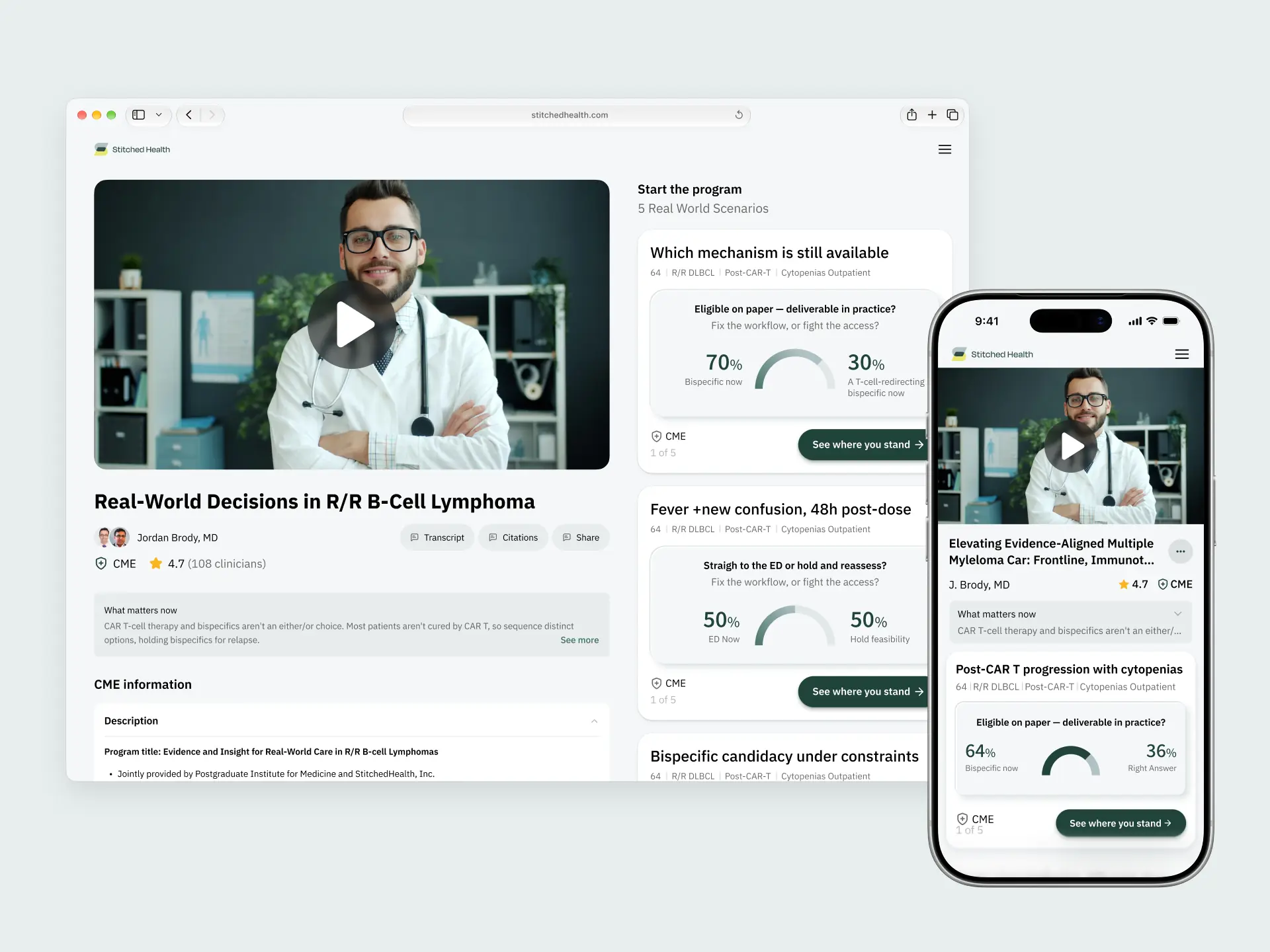
Stitched Health builds applied learning experiences that help clinicians translate medical evidence into real-world practice.
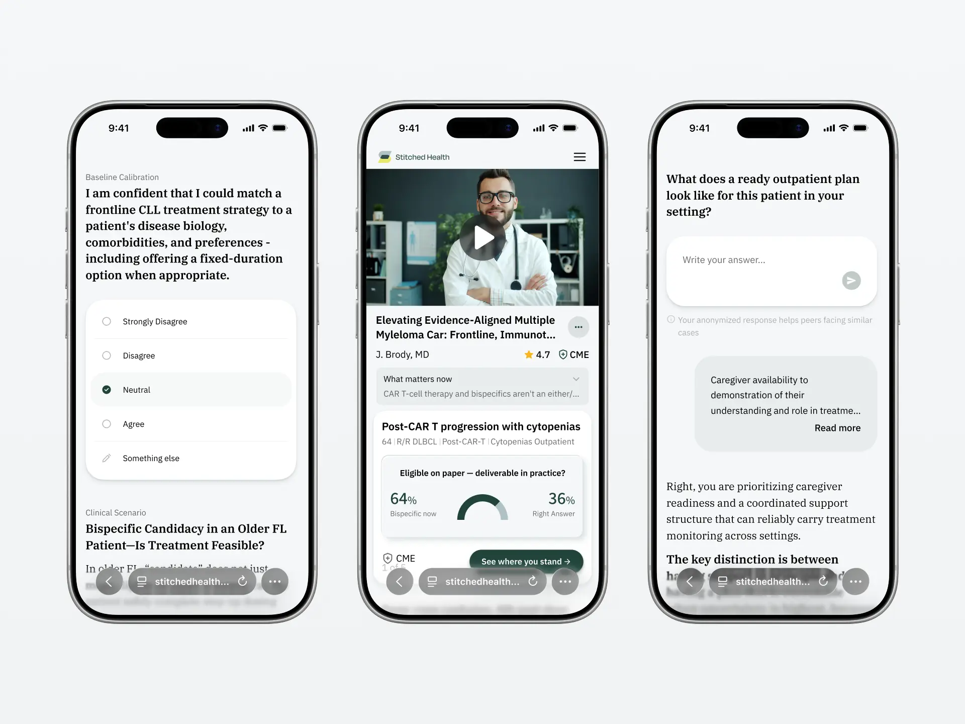
Building on our previous collaboration, we worked closely with the Stitched Health team and engineering partners to refine the existing experience across mobile and desktop. The focus was on making clinical scenarios more conversational, improving content hierarchy, and creating a more consistent design system.
Fragmented clinical flow
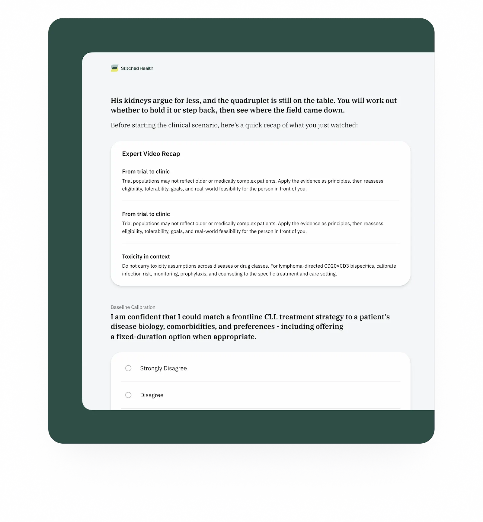
The existing interaction model required clinicians to move through a series of individual steps, interrupting the natural flow of clinical scenarios. The challenge was to create a more conversational experience that allowed clinicians to focus on the content rather than the mechanics of moving through it.
Cross-device inconsistency
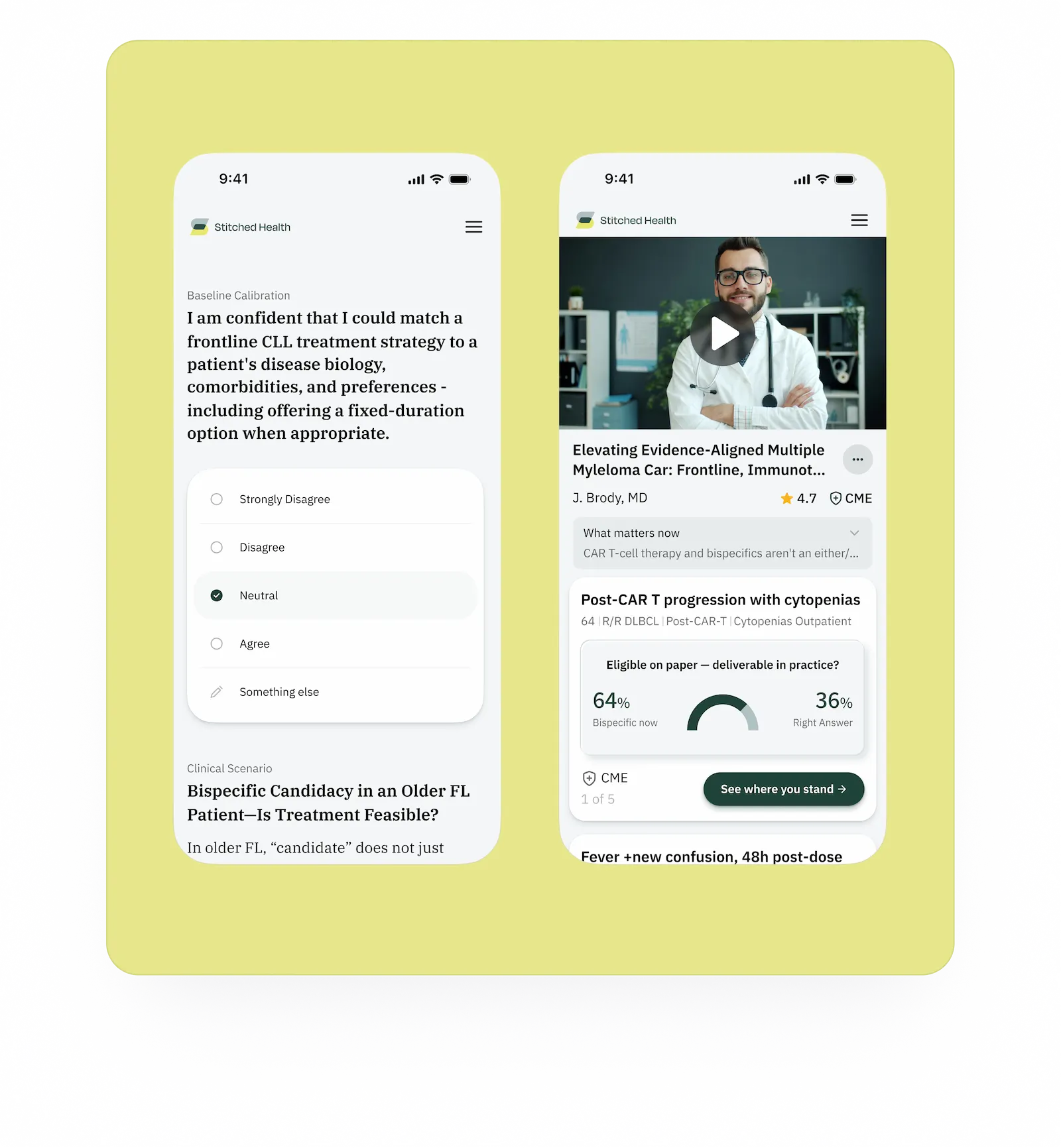
The experience also needed greater consistency across mobile and desktop. Layouts, components, and interaction patterns had to work together as part of a cohesive product rather than as isolated screens.
Unclear information hierarchy
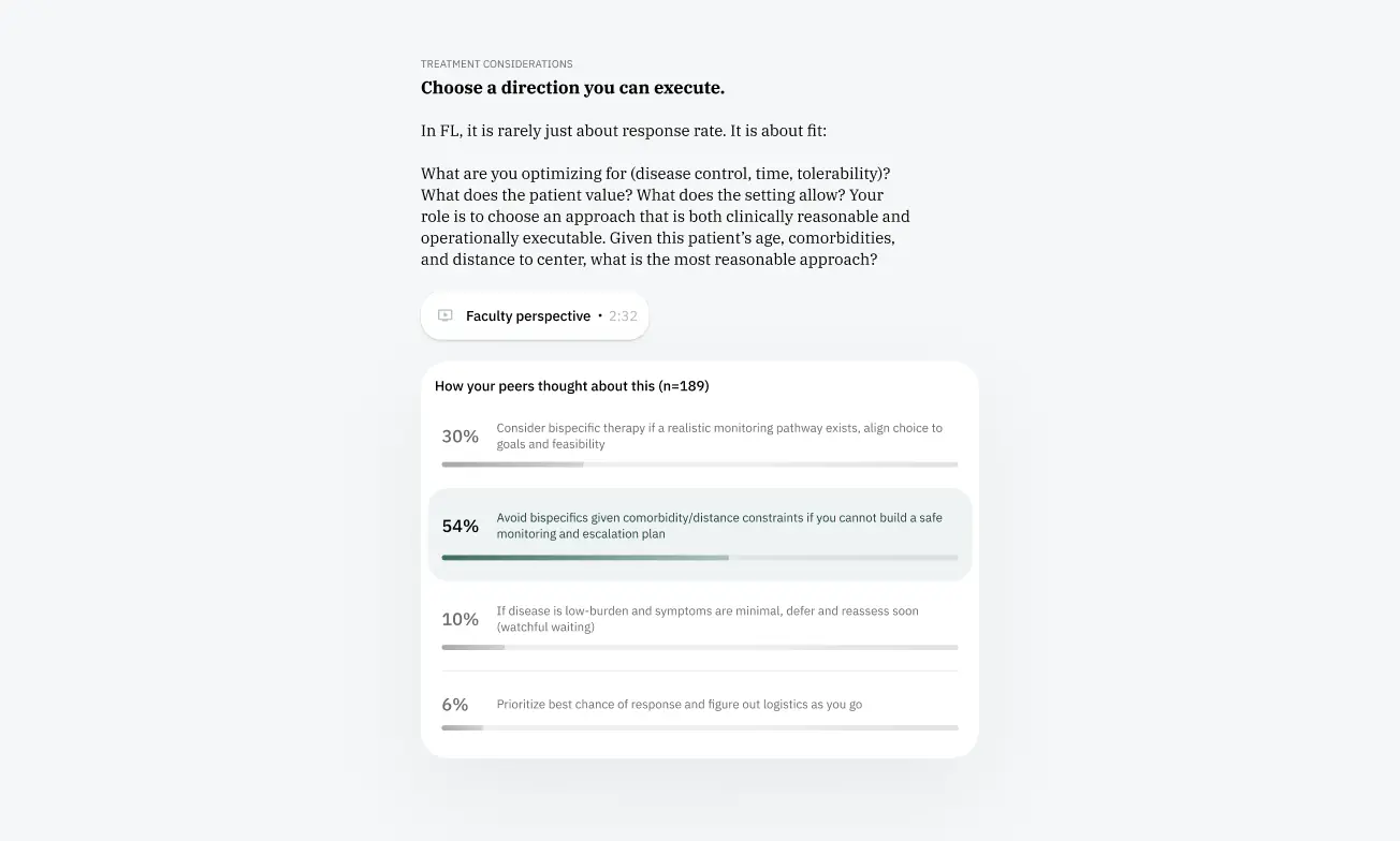
Each scenario brings together patient context, treatment considerations, expert commentary, peer responses, and supporting evidence. These different layers needed a clearer visual hierarchy to help clinicians understand the information and navigate each decision point.
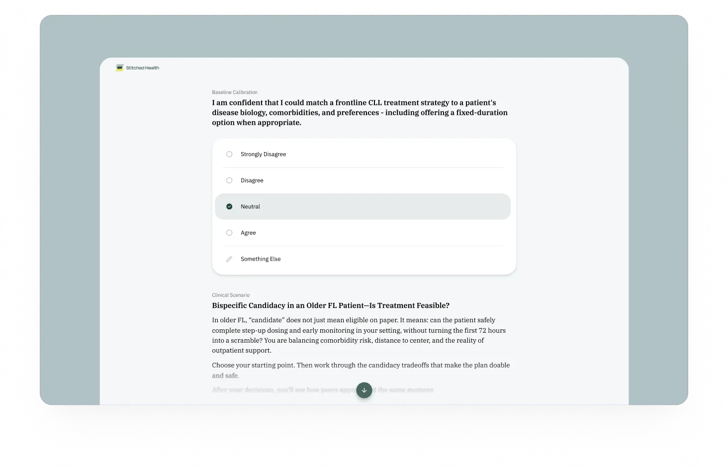
1. Built the job seeker's home base
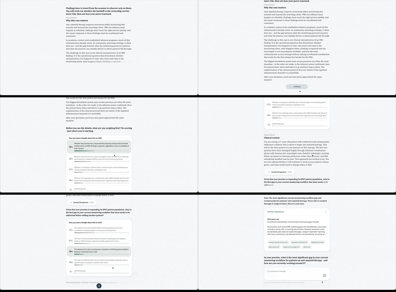
A key decision was to move away from the traditional survey format towards a conversational UX. Instead of progressing through disconnected steps, clinicians could respond to questions and receive expert insights, peer perspectives, and opportunities to reflect on their clinical decisions.
This required rethinking how questions were presented, how responses unfolded, and how information was introduced throughout a scenario. We refined the interaction flow to reduce unnecessary steps while giving each type of content a clear place within the conversation.The goal was to make the experience feel less like completing a survey and more like an exchange in which clinicians could learn from the information and perspectives presented to them.
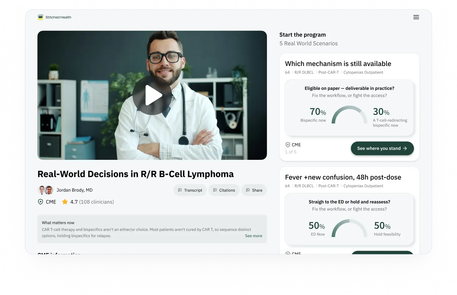
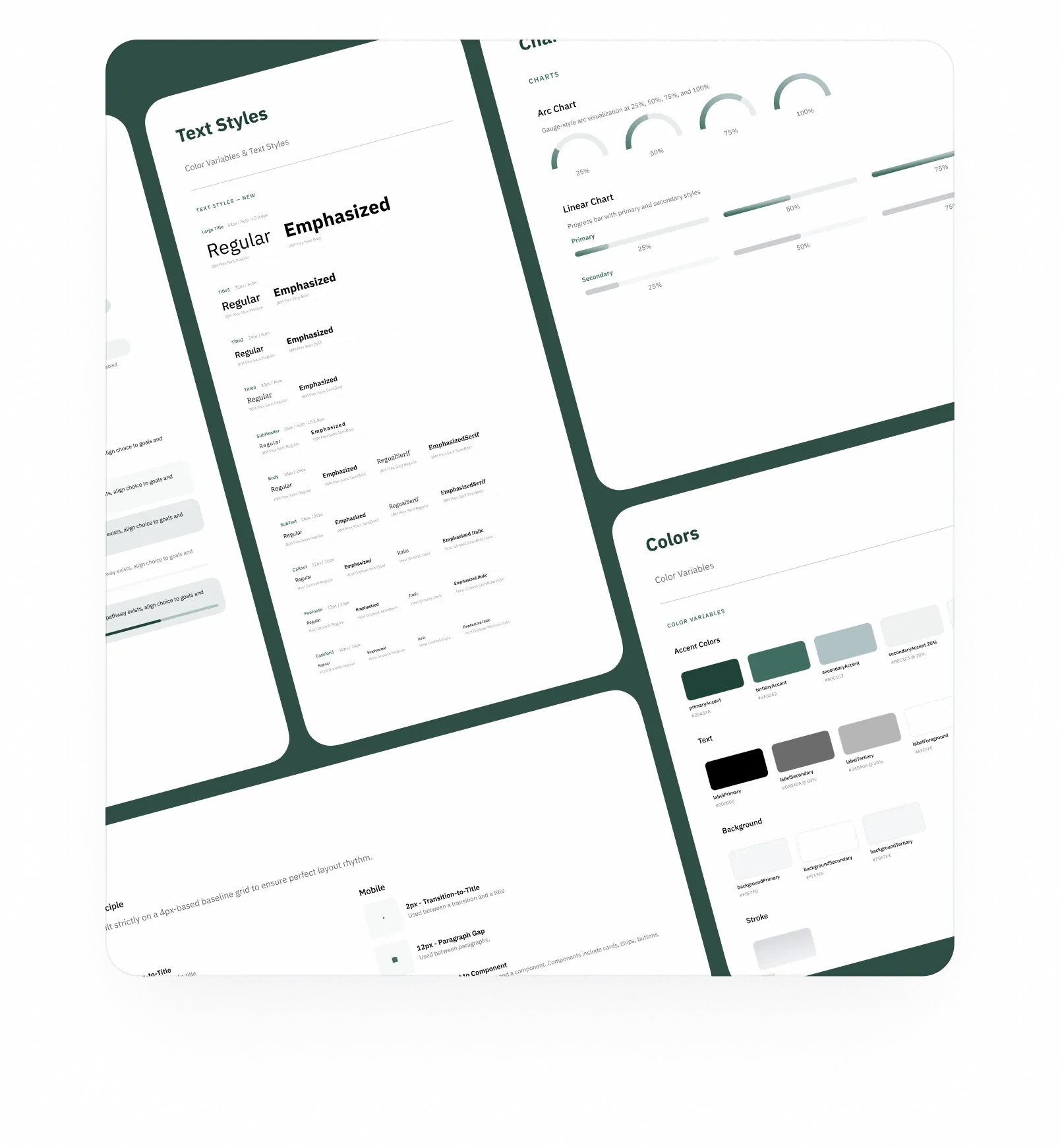
2. Building a cohesive design system
We refined the existing design system across spacing, typography, visual hierarchy, corner radii, colors, and chart styling. We also introduced new components to address gaps in the system.
Rather than treating each screen separately, we established consistent patterns that could be applied throughout the product. This was particularly important as the experience evolved towards a conversational model, where different types of content and interactions needed to feel like parts of the same system.
The result was a more cohesive visual language across mobile and desktop, with reusable components that could support further iterations.
3. Refining motion and interaction
Motion needed to do more than make the interface feel responsive. It had to help users understand how the experience progressed.
Through animation prototypes and several rounds of iteration, we explored how information appeared, transitioned, and unfolded throughout a clinical scenario. We refined these interactions to clarify what was changing and maintain a natural flow between questions, responses, and supporting content.
The challenge was to keep the experience moving without rushing the user. Transitions needed to feel fluid while leaving clinicians enough time to read, consider different perspectives, and reflect on their decisions.
By treating motion as part of the interaction design, we could use it to support the conversational flow rather than simply add visual polish.
Clarity for Clinicians, a Foundation for Growth
Returning to Stitched Health meant building on the work we had done together previously. This collaboration focused on refining the interaction model, improving the visual hierarchy, and bringing greater consistency to the experience across mobile and desktop.
From rethinking how clinicians moved through a scenario to refining the design system and exploring new interaction patterns, the work was guided by a common goal: making complex clinical content easier to navigate without losing its depth.Together, these explorations established a clearer direction for the product and a stronger foundation for its continued development.


Start a project


