
Unlocked.ai

Unlocked.ai — Mobile and Desktop job hunting platform
The short version
Unlocked.ai is a career platform that sits on both sides of the hiring table — one product for job seekers, one for the companies hiring them, wired together by an AI career assistant called Jónsi. Kaleo Design was brought in to take the platform from a functional but flat set of screens to a product that feels like it has a point of view: warm, a little playful, genuinely useful, and dense with information without ever feeling like a spreadsheet.
We designed the entire experience end to end — dashboards, job discovery, applications, interview prep, salary benchmarking, technical assignments, community events, achievements, and the employer-facing hiring suite — across desktop and native mobile. Two very different user bases, one coherent product.
Two bad options
Either they're sterile job boards that treat the search as a spreadsheet of postings, or they're gamified to the point of feeling gimmicky, all badges and no substance. Unlocked.ai wanted neither. The team had a real differentiator — an AI career coach that could actually prep you for an interview, tell you why a job was a good match, and coach you through a salary negotiation — but the existing interface buried that value under generic SaaS patterns.
A clean hiring cockpit
On the other side of the platform, employers needed something that felt less like a bloated ATS and more like a clean hiring cockpit: post a role, see where candidates are stalling, close the loop fast.
Both audiences at once
We had to solve for both audiences at once, without the product feeling like two separate apps stitched together.

1. Built the job seeker's home base
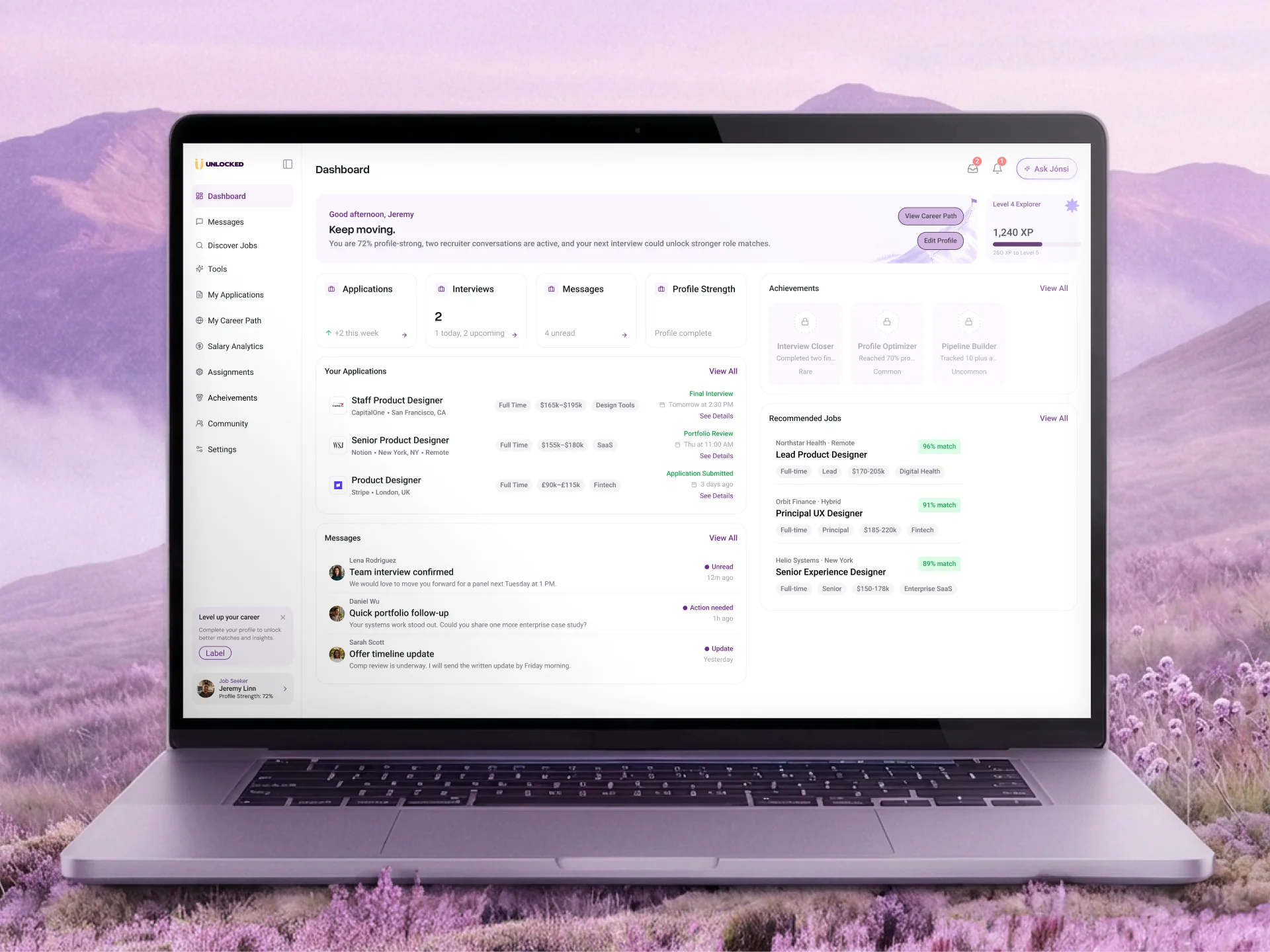
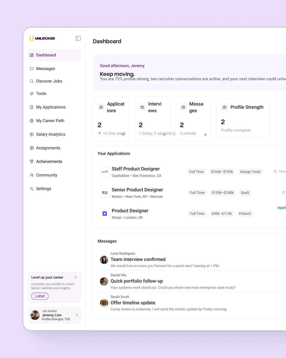
The dashboard is the anchor of the whole product, and we treated it that way. Instead of a generic “here's your data” layout, we built it around a simple emotional beat: you're making progress, keep going. A personalized greeting, a plain-language summary of where things stand (“You are 72% profile-strong, two recruiter conversations are active...”), and a visible XP bar tied to a leveling system that runs quietly in the background of the entire product.
Below that, four stat cards — Applications, Interviews, Messages, Profile Strength — give a job seeker their status at a glance, backed by a live feed of applications, unread messages, and jobs matched specifically to their profile with a percentage-match score. Nothing here is decorative. Every card links somewhere real.
2. Made job discovery feel like curation, not scrolling
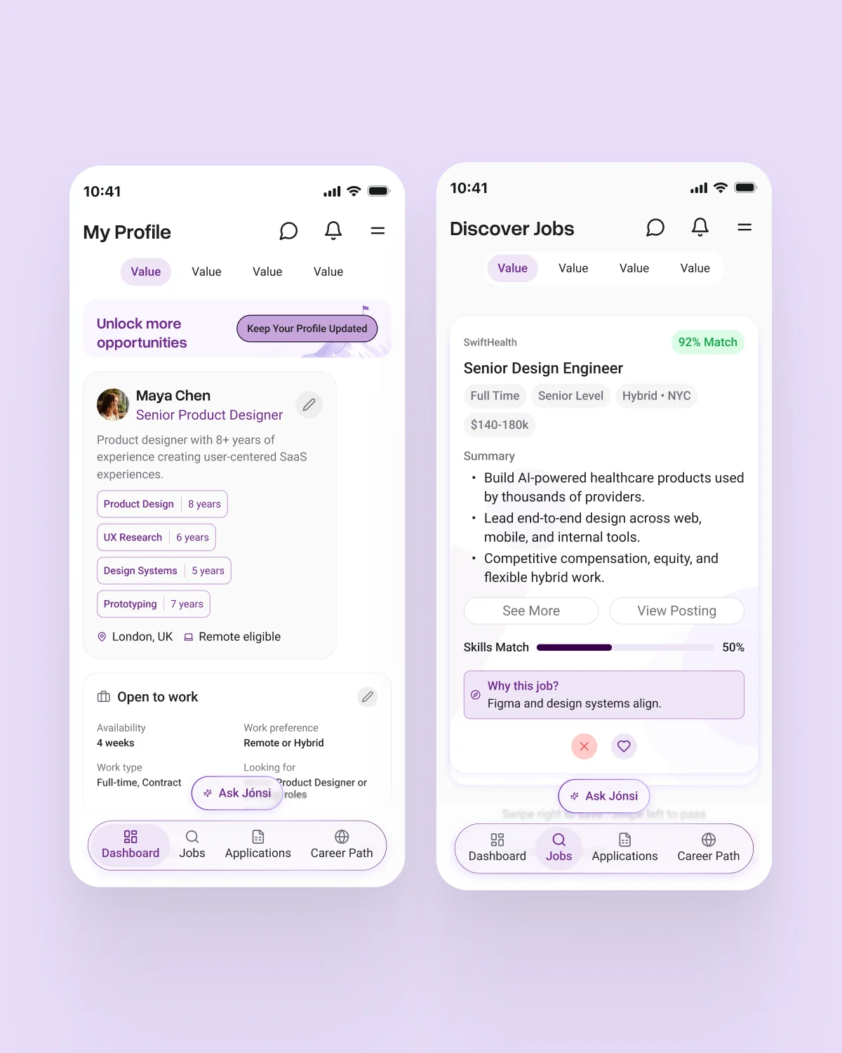
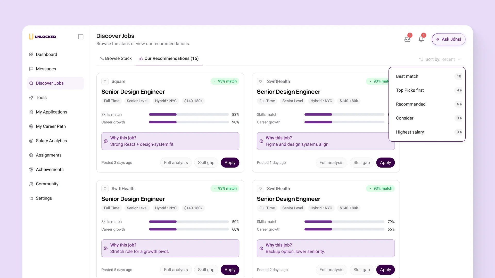
The Discover Jobs experience splits into two modes: a browsable stack (swipe-to-pass, swipe-to-save, mobile-first) and a ranked recommendations feed sorted by “Best match,” “Highest salary,” or “Consider.” Every job card carries a skills-match bar and career-growth bar rather than a wall of text, plus a short, plain-English “Why this job?” callout — “Strong React + design-system fit,” “Backup option, lower seniority” — so the reasoning behind the AI's ranking is never a black box.
Tapping into a role opens a full detail view with benefits, compensation breakdown (base, equity, bonus), and key responsibilities, without ever losing the sense that this was picked for you, not pulled from a generic feed.
3. Gave the AI assistant, Jónsi, a real presence
Jónsi isn't a chatbot bolted onto a corner of the screen. It's positioned as the connective tissue of the product — accessible from a persistent “Ask Jónsi” button in the header, and expanding into a full sidebar panel for account setup, interview prep, and career coaching conversations. We designed it to feel like a colleague you can ask a real question, not a support widget you're avoiding.
That shows up most clearly in Interview Prep, where Jónsi generates a tailored checklist ahead of a specific interview — “Review Cloud, CI/CD, and IaC concepts,” “Spin up a mock production environment” — alongside a running completion count and a set of prep questions built directly from the role you applied to.


4. Designed a career path tool that actually explains itself
My Career Path was one of the more ambitious pieces of the system. Rather than a static roadmap, we designed it as a conversation: a selected career track (say, Product Marketing Lead) comes with a written rationale for why this path fits you, a current-stage assessment, and a role-progression timeline that expands into milestones. A running Notes panel lets the user (or Jónsi) log observations over time, turning career planning into something that accumulates rather than resets every visit.
5. Built a gamification layer with actual teeth
Levels, XP, badges, streaks, a leaderboard, weekly challenges — all of it sits on top of real product actions (uploading a CV, applying to three jobs, starting a Jónsi session), so progress in the game is progress in the job search. Badges are rarity-tiered (Common, Rare) and visibly locked until earned, which does more for motivation than a flat checklist ever could. We were careful to keep this system supportive rather than noisy — it never interrupts the core task, it just quietly tracks it.
6. Rebuilt salary transparency into something you can act on
Salary Analytics pulls market median, target salary, percentile bands, and a full salary distribution chart for a specific role, location, and experience level, then layers in a skills-impact table — “Add WCAG accessibility to your CV to push into the top 20%” — so the data isn't just informative, it's directive. This is the kind of screen that's easy to make boring; we didn't let it be.
7. Designed the other half of the platform: the employer suite
Flip the account type and the whole shell reconfigures around hiring instead of job hunting — Job Listings, Candidates, Analytics, Branding, Team Management. We built a Jobs table with live status tracking (Live, Draft, Closed, Paused) and applicant counts, and an Analytics dashboard that surfaces pipeline bottlenecks in plain language — “Large drop between Views and Applications: -100% gap” — instead of forcing a hiring manager to reverse-engineer a funnel chart. Performance trends and conversion-rate charts round it out, exportable in one click.
We also carried the same account-settings pattern across both sides — hiring visibility toggles, default currency, minimum match score thresholds, anonymous candidate review — so switching between “job seeker me” and “employer me” never feels like switching products.
8. Extended everything natively to mobile
Nothing here was an afterthought squeeze of the desktop layout. We rebuilt the core flows — onboarding, profile, job discovery, salary analytics, messages, community, technical assignments, AI tools — as native mobile patterns: swipeable job cards, bottom tab navigation, locked-state cards that clearly explain what unlocks them and how. The mobile app had to carry the same warmth and clarity as desktop while doing significantly more with significantly less space.
9. Rounded out the supporting cast
Beyond the core loop, we designed the full surrounding ecosystem: a Messages inbox with inline scheduling (pick a date, pick a timeslot, reply without leaving the thread), a Community tab for local and virtual meetups with attendance counts, and a Technical Assignments tracker for take-home tests and design challenges, complete with countdown timers and submission status.


Design language
We settled on a warm lavender-and-plum palette that reads as premium without tipping into corporate-cold, paired with a clean sans-serif type system and a consistent card-and-badge vocabulary that repeats across every module — match percentages, status pills, skill tags — so a user's eye never has to relearn the interface from screen to screen. The mountain-and-flag motif on the dashboard and career path headers became a quiet visual thread tying “career growth” back to something more human than a progress bar.
Every module — dashboard, jobs, tools, assignments, community, achievements, career path, messages, settings — shares the same left-hand navigation shell, the same header pattern, the same notification and Jónsi entry points. It sounds obvious in writing. In practice, holding that discipline across roughly twenty distinct screens and two platforms is most of what separates a coherent product from a collection of mockups.
The outcome
What shipped is a platform that doesn't feel like it's choosing between “serious tool” and “delightful product” — it's both, at the same time, for two different audiences, on two different screen sizes. Job seekers get an AI-backed system that actually explains its reasoning instead of hiding behind a match score. Employers get a hiring dashboard that tells them where their funnel is actually breaking instead of just how many resumes came in this week.
For Kaleo Design, this was a chance to design a full product ecosystem from the ground up — not a redesign of an existing pattern, but the definition of one. Dashboards, AI conversation patterns, gamification, dual-sided account systems, native mobile — all built to work as one coherent language rather than twenty separate decisions.


Start a project


